According to Mayer, the term multimedia refers to the simultaneous presentation of both words and pictures (2014). With multimedia, learners can create deeper understanding while they form connections between words and pictures; however, to be effective, multimedia must be designed in a manner which promotes learning (Mayer, 2014).
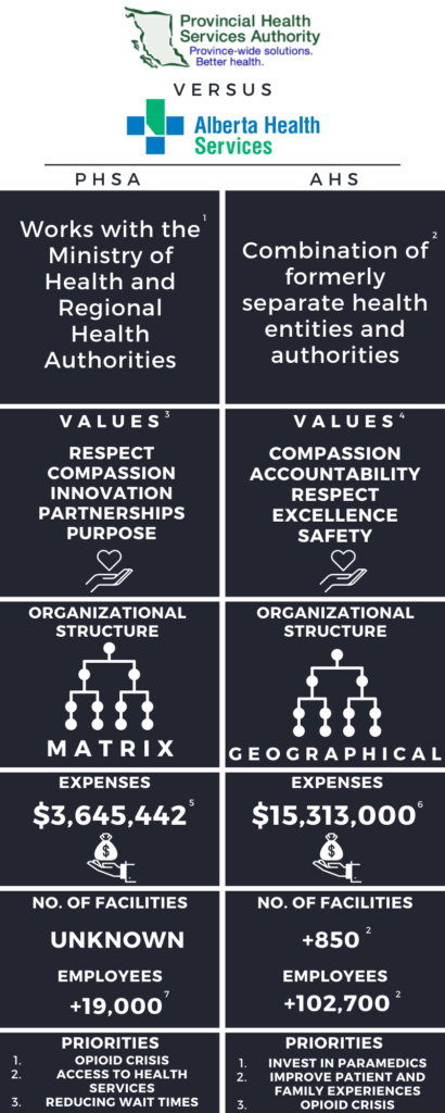
For this assignment, I updated an infographic I previously created for a class during my second year at UVic. The purpose of this infographic was to compare two different health authorities: Provincial Health Services Authority (PHSA) and Alberta Health Services (AHS) (See Figure 1). Despite being a relatively straightforward infographic, the artifact’s design fails to fulfill many of the multimedia learning principles, and related theories we have discussed in EDCI337. As a result, I updated specific elements of my infographic to make it more effective in increasing knowledge transfer.

The multimedia principle states people learn better when words are used in conjunction with pictures (Mayer, 2014). While my previous infographic incorporated images, the artifact was relatively text heavy. To adhere to the multimedia principle, I replaced text with photos where possible. For example, instead of listing each health authority’s values with text, I used images to represent the values instead. Further, I also added photos to illustrate and clarify various concepts. For instance, instead of plainly stating each health authority’s organizational structure, I added graphics which visually represent the different structures. In adding visual elements to my infographic, not only was I able to fulfill the multimedia principle, but I was also able to satisfy a few of the Universal Design for Learning (UDL) guidelines.
UDL is a framework which aims to optimize learning by identifying and removing barriers in the design of instructional materials (CAST, n.d.). One of the UDL guidelines is representation, and this guideline ensures learning is accessible by providing students with options for perception, comprehension, and language and symbols (CAST, 2018). By pairing each concept with symbols or pictures, I was able to increase my infographic’s accessibility for learners with different background, language, and lexical knowledge. More precisely, by providing alternate representations of meaning for each concept, I was able to clarify vocabulary and symbols, and offer alternatives for both auditory and visual information (CAST, 2018).
Considering the text in my infographic was now replaced with images, I decided to narrate the contents of my infographic to provide further detail. In doing so, I was able to improve learning by applying the modality principle: people learn better when graphics are paired with narration instead of printed text (Mayer, 2014). Additionally, I made sure to speak in a conversational style during my narration. This is because according to the personalization principle, learning improves when the words of a multimedia presentation are not spoken in a formal style (Mayer, 2014). Finally, since my infographic contains quite a bit of information, I added arrows to appropriately direct learners’ attention, and reduce their cognitive load. As a result, the signaling principle asserts learning improves, for people learn better when key information is emphasized through application of cues (Mayer, 2014).
While my infographic was more accessible and effective in increasing knowledge transfer at this point in the redesign process, it lacked good design. To address this issue, I applied a few of Adobe’s Basic Principles of Design; the main principles I focused on were alignment, contrast, and colour. The alignment principle ensures design elements are positioned appropriately in relation to each other, and I achieved this by lining up the text and shapes in my infographic (Adobe Express, 2020). Regarding the contrast principle, this principle suggests using opposing design elements, such as colour, to emphasize and support design (Adobe Express, 2020). To fulfill this principle, I changed the background of my infographic from black to blue and orange. I selected these colours because they are on opposing segments of the colour wheel. Additionally, selecting blue and orange increased the accessibility of my infographic further, for it is a colorblind-friendly combination (Shaffer, 2016).
Overall, by redesigning various elements of my infographic, I was able to improve knowledge transfer, and remove various barriers to learning. To view my updated infographic, please see Figure 2.
References
Adobe Express. (2020). 8 basic design principles to help you make awesome graphics. Adobe. https://www.adobe.com/express/learn/blog/8-basic-design-principles-to-help-you-create-better-graphics
CAST. (n.d.). About universal design for learning. https://www.cast.org/impact/universal-design-for-learning-udl
CAST. (2018). Universal design for learning guidelines version 2.2. Retrieved from http://udlguidelines.cast.org
Mayer, R. E. (Ed.). (2014). The Cambridge handbook of multimedia learning (2nd ed.). Cambridge University Press. https://doi.org/10.1017/CBO9781139547369
Shaffer, J. (2016). 5 tips on designing colorblind-friendly visualizations. Tableau. https://www.tableau.com/about/blog/examining-data-viz-rules-dont-use-red-green-together#:~:text=For%20example%2C%20blue%2Forange%20is,blue%20to%20someone%20with%20CVD.
Recent Comments